RPMoreOptions Beta
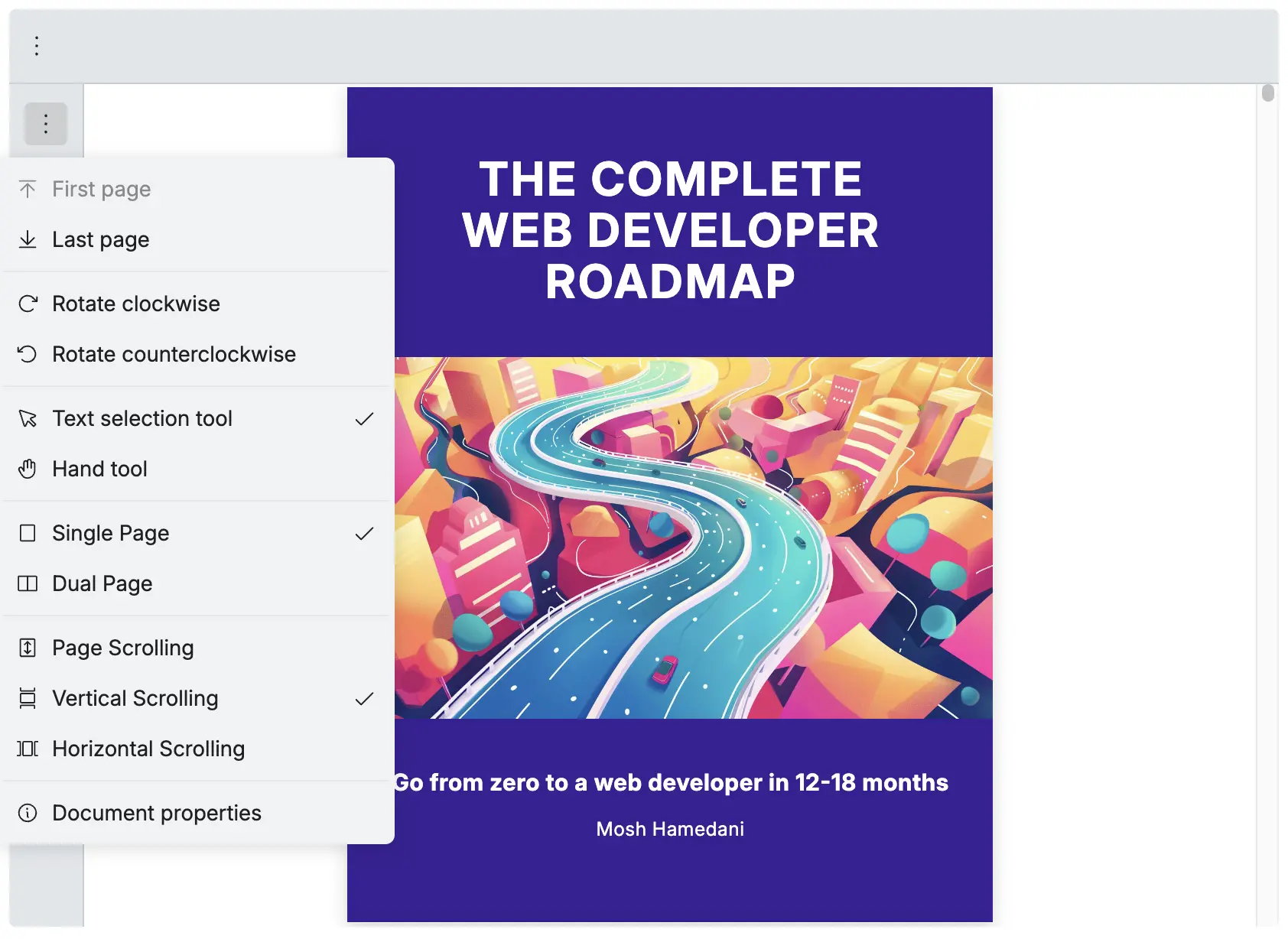
The RPMoreOptions displays the default menu items in the more options dropdown, allowing customization of icons, hiding/showing menu items, and adding custom menu items.
Mobile view behavior, when the PDF viewer is displayed in mobile view (container width below the breakpoint), tools such as openFileTool, downloadTool, printTool, and fullscreenTool are automatically grouped under the RPMoreOptions tool to optimize the mobile interface and save space in the toolbar. see Mobile View for more information.
| Name | Type | Description |
|---|---|---|
| icons | RPMoreOptionsIcons | Change the icons for each menu item |
| slots | RPMoreOptionsSlots | Show or hide specific menu items |
| slotTop | React.ReactNode | Add custom menu items at the top of the dropdown |
| slotBottom | React.ReactNode | Add custom menu items at the bottom of the dropdown |
RPMoreOptionsIcons
Section titled “RPMoreOptionsIcons”| Name | Type | Description |
|---|---|---|
| openFileIcon | React.ReactNode | To change the icon of the open file button |
| downloadIcon | React.ReactNode | To change the icon of the download button |
| printIcon | React.ReactNode | To change the icon of the print button |
| fullScreenIcon | React.ReactNode | To change the icon of the full screen button |
| goToFirstPageIcon | React.ReactNode | To change the icon of the go to first page button |
| goToLastPageIcon | React.ReactNode | To change the icon of the go to last page button |
| rotateClockwiseIcon | React.ReactNode | To change the icon of the rotate clockwise button |
| rotateCounterClockwiseIcon | React.ReactNode | To change the icon of the rotate counter clockwise button |
| textSelectionIcon | React.ReactNode | To change the icon of the text selection button |
| handModeIcon | React.ReactNode | To change the icon of the hand mode button |
| singlePageIcon | React.ReactNode | To change the icon of the single page button |
| dualPageIcon | React.ReactNode | To change the icon of the dual page button |
| pageScrollIcon | React.ReactNode | To change the icon of the page scroll button |
| verticalScrollIcon | React.ReactNode | To change the icon of the vertical scroll button |
| horizontalScrollIcon | React.ReactNode | To change the icon of the horizontal scroll button |
| documentPropertiesIcon | React.ReactNode | To change the icon of the document properties button |
Change the icon of each tool
Section titled “Change the icon of each tool”Replace the default icons with your own custom icons using the icons prop.
import { RPConfig, RPProvider, RPLayout, RPPages, RPVerticalBar } from '@pdf-viewer/react'
const HeartIcon = (  <svg width="24" height="24" viewBox="0 0 24 24" fill="red" xmlns="http://www.w3.org/2000/svg">    <path d="M12 21s-6-4.35-9-7.69C-1 8.07 3.6 2.6 8.44 6.24L12 9l3.56-2.76C20.4 2.6 25 8.07 21 13.31 18 16.65 12 21 12 21z" />  </svg>)
const AppPdfViewer = () => {  return (    <RPConfig licenseKey="YOUR_LICENSE_KEY">      <RPProvider src="https://cdn.codewithmosh.com/image/upload/v1721763853/guides/web-roadmap.pdf">        <RPLayout          toolbar={{            topbar: {              component: (                <RPMoreOptions                  icons={{                    documentPropertiesIcon: HeartIcon                  }}                />              )            }          }}        >          <RPPages />        </RPLayout>      </RPProvider>    </RPConfig>  )}export default AppPdfViewer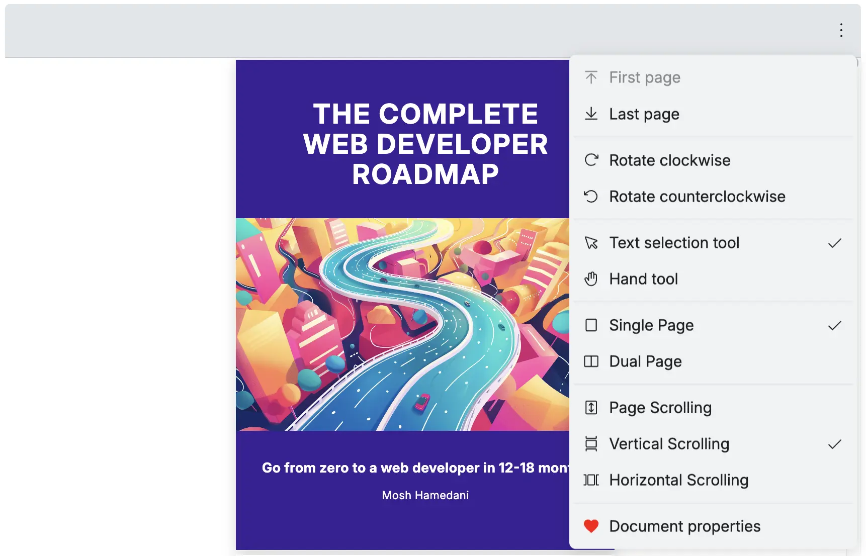
Note: Use this same method to change any of the icons listed in RPMoreOptionsIcons.
RPMoreOptionsSlots
Section titled “RPMoreOptionsSlots”| Name | Type | Description |
|---|---|---|
| openFileTool | boolean | To show or hide the open file tool |
| downloadTool | boolean | To show or hide the download tool |
| printTool | boolean | To show or hide the print tool |
| fullscreenTool | boolean | To show or hide the fullscreen tool |
| jumpNavigationTool | boolean | To show or hide the jump navigation tool |
| rotateTool | boolean | To show or hide the rotate tool |
| selectionModeTool | boolean | To show or hide the selection mode tool |
| viewModeTool | boolean | To show or hide the view mode tool |
| scrollModeTool | boolean | To show or hide the scroll mode tool |
| documentProperties | boolean | To show or hide the document properties |
Hide each tool
Section titled “Hide each tool”To hide any tool, set it to false in the slots prop
<RPMoreOptions slots={{ openFileTool: false, downloadTool: false, printTool: false, fullscreenTool: false, jumpNavigationTool: false, rotateTool: false, selectionModeTool: false, viewModeTool: false, scrollModeTool: false // documentProperties: false (this will show only the documentProperties tool) }}/>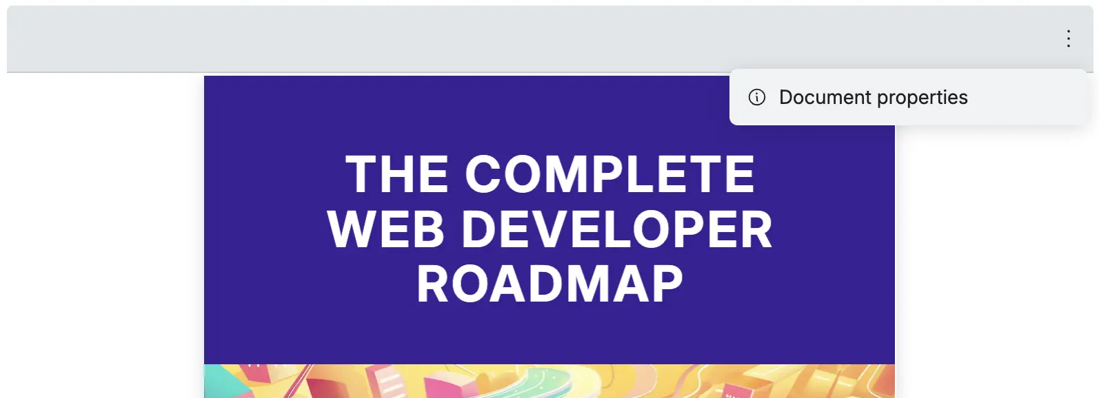
Note: If you hide all tools (set slots all to false), the RPMoreOptions toll will automatically hide itself because there are no tools to show.
Mobile view behavior
Section titled “Mobile view behavior”When the PDF viewer is displayed in mobile view, tools such as openFileTool, downloadTool, printTool, and fullscreenTool are automatically grouped under the RPMoreOptions tool.
Default mobile view behavior
Section titled “Default mobile view behavior”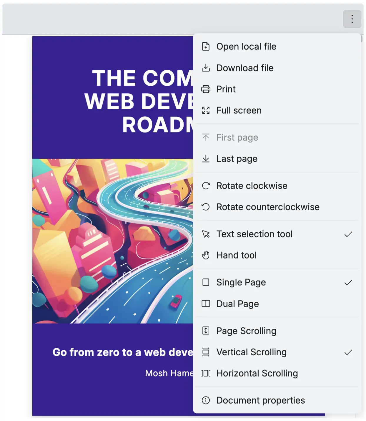
Prevent mobile view behavior
Section titled “Prevent mobile view behavior”If you want to prevent this behavior, you can set the slots prop to false for these tools.
<RPMoreOptions slots={{ openFileTool: false, downloadTool: false, printTool: false, fullscreenTool: false }}/>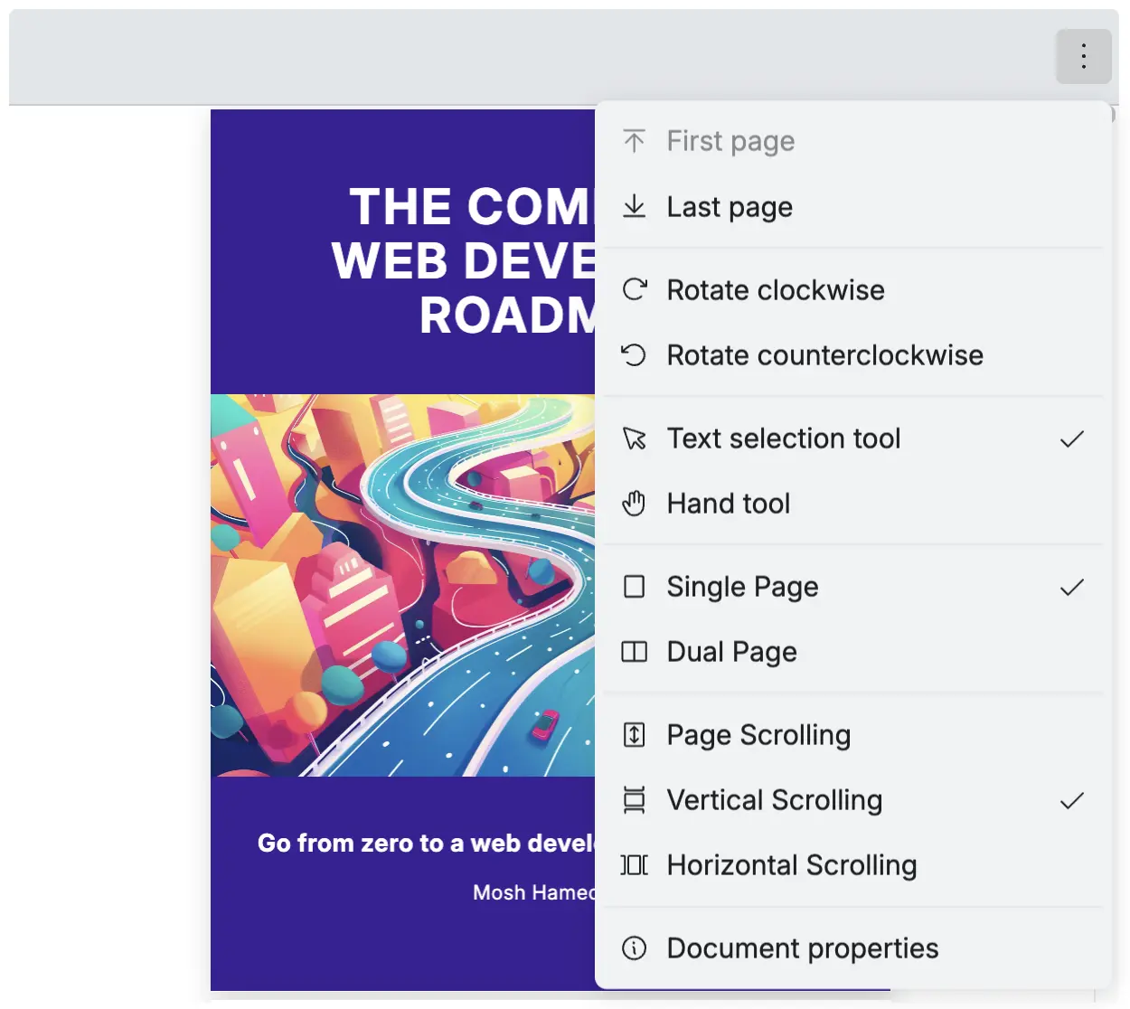
RPMenuItem
Section titled “RPMenuItem”The RPMenuItem is used to create custom menu items in the RPMoreOptions tool. You can add your own icons, labels, tooltips, and click actions.
| Name | Type | Description |
|---|---|---|
| icon | React.ReactNode | The icon to display for the menu item |
| label | string | The text label displayed for the menu item |
| tooltip | string | The tooltip text shown when hovering over the menu item |
| onClick | () => void | (optional) callback function triggered when the menu item is clicked |
| menuSeparator | boolean | (optional) attribute to add a separator line above or below the menu item |
| menuSeparatorPosition | ’top’ | ‘bottom’ | (optional) position for the separator line when menuSeparator is true |
Add menu item to RPMoreOptions tool
Section titled “Add menu item to RPMoreOptions tool”Add a custom menu item to the RPMoreOptions tool using the slotTop or slotBottom prop.
import {  RPConfig,  RPProvider,  RPLayout,  RPPages,  RPMoreOptions,  RPMenuItem} from '@pdf-viewer/react'
const HeartIcon = (  <svg xmlns="http://www.w3.org/2000/svg" width="16" height="16" fill="red" viewBox="0 0 24 24">    <path d="M12 21.35l-1.45-1.32C5.4 15.36 2 12.28 2 8.5 2 5.42 4.42 3 7.5 3c1.74 0 3.41 0.81 4.5 2.09C13.09 3.81 14.76 3 16.5 3 19.58 3 22 5.42 22 8.5c0 3.78-3.4 6.86-8.55 11.54L12 21.35z" />  </svg>)
const AppPdfViewer = () => {  const handleCustomAction = () => {    console.log('Custom menu item clicked!')    // Add your custom logic here  }
  return (    <RPConfig licenseKey="YOUR_LICENSE_KEY">      <RPProvider src="https://cdn.codewithmosh.com/image/upload/v1721763853/guides/web-roadmap.pdf">        <RPLayout          toolbar={{            topbar: {              component: (                <div style={{ marginLeft: 'auto' }}>                  <RPMoreOptions                    slotTop={                      <RPMenuItem                        icon={HeartIcon}                        label="Custom Action"                        tooltip="Perform a custom action"                        onClick={handleCustomAction}                      />                    }                  />                </div>              )            }          }}        >          <RPPages />        </RPLayout>      </RPProvider>    </RPConfig>  )}
export default AppPdfViewer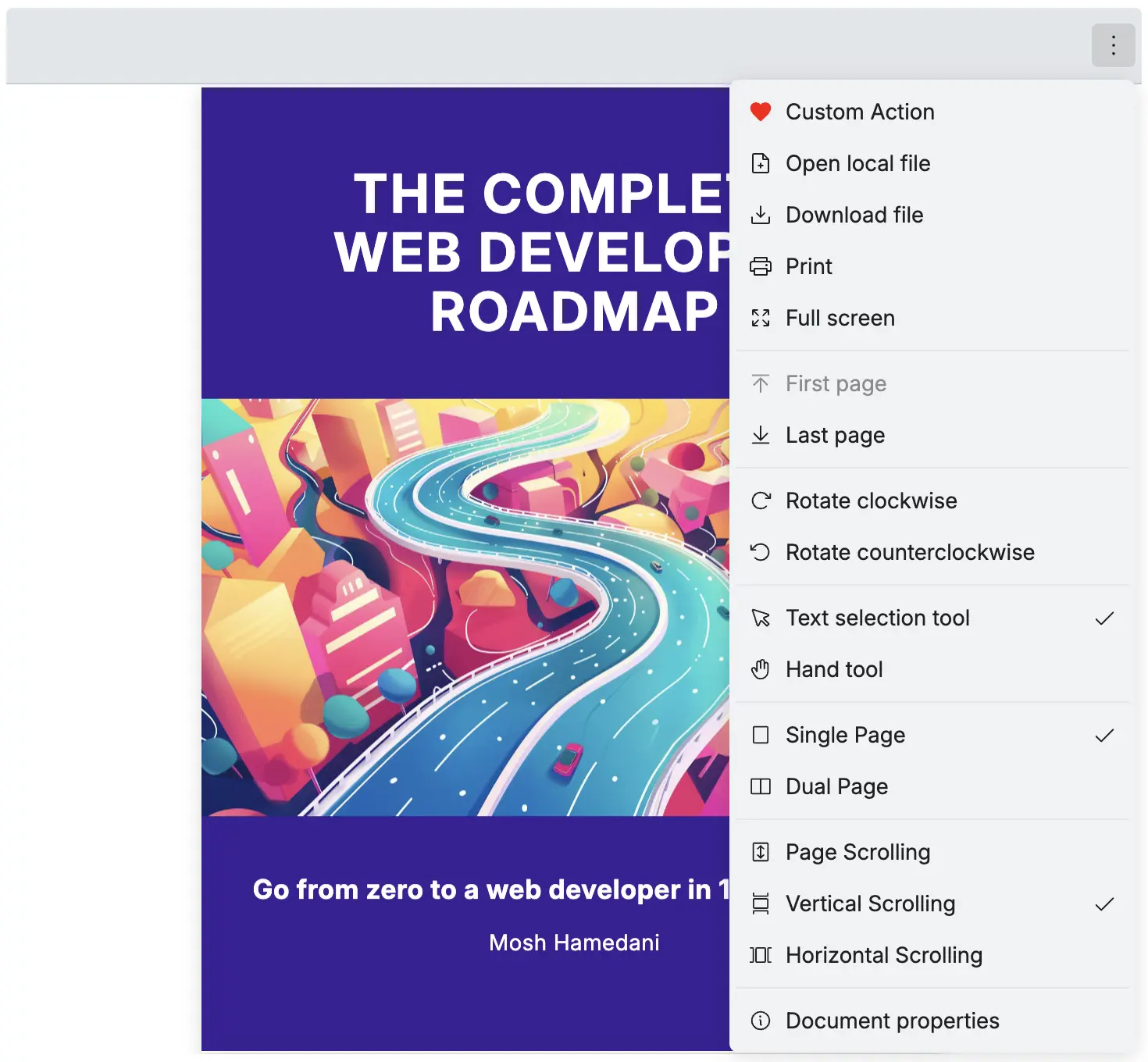
Adding Menu Separators
Section titled “Adding Menu Separators”Use the menuSeparator and menuSeparatorPosition props to add separator lines between menu items in the RPMoreOptions tool.
<RPMoreOptions slotTop={ <> <RPMenuItem icon={HeartIcon} label="First Item" tooltip="First menu item" onClick={() => console.log('First item clicked')} /> <RPMenuItem icon={HeartIcon} s label="Second Item" tooltip="Second menu item with separator" onClick={() => console.log('Second item clicked')} menuSeparator={true} menuSeparatorPosition="bottom" /> </> } slotBottom={ <> <RPMenuItem icon={HeartIcon} label="Third Item" tooltip="Third menu item" onClick={() => console.log('Third item clicked')} menuSeparator={true} menuSeparatorPosition="top" /> <RPMenuItem icon={HeartIcon} label="Fourth Item" tooltip="Fourth menu item with separator" onClick={() => console.log('Fourth item clicked')} menuSeparator={true} menuSeparatorPosition="top" /> </> }/>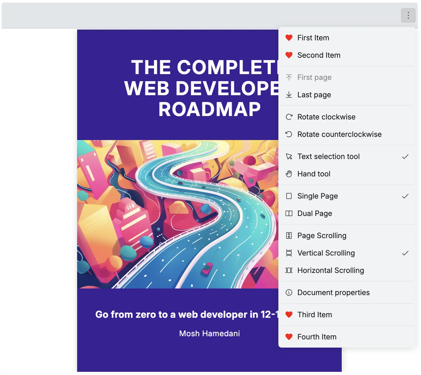
Bonus: RPMoreOptions with RPLayout
Section titled “Bonus: RPMoreOptions with RPLayout”You can use the RPMoreOptions with the RPLayout to create a more options dropdown with a custom toolbar to topbar and leftSidebar. For more information on how to customize your toolbar, check out Customize Toolbar.
<RPLayout toolbar={{ topbar: { component: <RPMoreOptions /> }, leftSidebar: { component: <RPMoreOptions /> } }}> <RPPages /></RPLayout>