Adjust Styles
CSS variables are provided to enable developers to overwrite them.
Listed below are some of the most commonly used variables. All other variables (rp-variables.css) can be found in our GitHub.
Default variables
/* Global */--rp-font-family: Inter, Avenir, Helvetica, Arial, sans-serif;--rp-primary-color: #34affc;--rp-border-radius: 4px;--rp-text-color: #1c2024;--rp-outline-color: var(--rp-primary-color);--rp-font-size: 16px;/* Drop zone mask */--rp-drop-mask-background-color: #fafafa;/* Loader */--rp-loader-backdrop-color: #ffffffcc;/* Icon */--rp-icon-disabled: #c6ccd2;--rp-icon-font-size: calc(var(--rp-font-size) * 1.25);/* Toolbar */--rp-toolbar-background: #e2e6e9;--rp-toolbar-border-color: #c6ccd2;--rp-toolbar-padding: 0.25rem;/* Sidebar */--rp-sidebar-width: 48px;/* Thumbnail */--rp-thumbnail-border-color: #e2e6e9;--rp-thumbnail-background-color: #ffffff;--rp-thumbnail-active-color: #00000033;/* Button */--rp-button-hover-background: #0000001a;--rp-button-padding: 4px;/* Input */--rp-input-padding: 0.5rem;--rp-input-border-radius: calc(var(--rp-border-radius) + 2px);--rp-input-background-color: #ffffff;/* Pages */--rp-pages-background-color: #ffffff;/* Annotations */--rp-annotation-layer__link-hover-background: rgba(255, 255, 0, 0.2);/* Dropdown */--rp-dropdown-background-color: #f1f2f4;--rp-dropdown-padding: 4px;--rp-dropdown-hover-background-color: #0000001a;--rp-dropdown-separator-color: #e2e6e9;--rp-dropdown-separator-margin: 4px;/* Popover */--rp-popover-font-size: calc(var(--rp-font-size) * 0.875);--rp-popover-background-color: #f1f2f4;/* Dialog */--rp-overlay-background-color: #000000cc;--rp-dialog-background-color: #f1f2f4;--rp-properties-divider-color: #e2e6e9;--rp-properties-divider-margin: 16px;--rp-property-item-gap: 12px;--rp-dialog-title-color: #1c2024;--rp-property-item-label-color: #596673;/* Print progress */--rp-print-progress-background: #f1f2f4ff;--rp-print-progress-color: #1c2024ff;/* Drop zone */--rp-drop-zone-border: #c6ccd2;--rp-drop-zone-font-color: #8c99a6;/* Checkbox */--rp-checkbox-border-radius: var(--rp-border-radius);--rp-checkbox-border-color: #e2e6e9;/* Highlight */--rp-highlight-background-color: rgba(255, 255, 0, 1);--rp-text-layer-highlight-border-radius: var(--rp-border-radius);/* Tooltip */--rp-tooltip-background-color: #1c2024;How to override the default styles
Section titled “How to override the default styles”To override default CSS styles, you may pass your own style into the RPTheme components.
Here are a few examples:
Changing the toolbar’s background and text color
Section titled “Changing the toolbar’s background and text color”import { RPProvider, RPConfig, RPTheme, RPDefaultLayout, RPPages } from '@pdf-viewer/react'
export const AppPdfViewer = () => { return ( <RPConfig> <RPTheme // Set your styles to the CSS variables customVariables={{ '--rp-text-color': '#666600', '--rp-toolbar-background': '#FFFFE0', '--rp-pages-background-color': '#F8F8FF', }} // Set your dark mode styles to the CSS variables customDarkVariables={{ '--rp-text-color': '#FFFFE0', '--rp-toolbar-background': '#666600', '--rp-pages-background-color': '#5C4033', }} > <RPProvider src="https://cdn.codewithmosh.com/image/upload/v1721763853/guides/web-roadmap.pdf"> <RPDefaultLayout> <RPPages /> </RPDefaultLayout> </RPProvider> </RPTheme> </RPConfig> )}import { RPProvider, RPConfig, RPTheme, RPDefaultLayout, RPPages } from '@pdf-viewer/react'
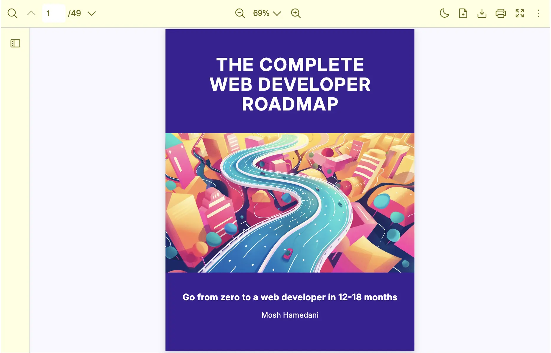
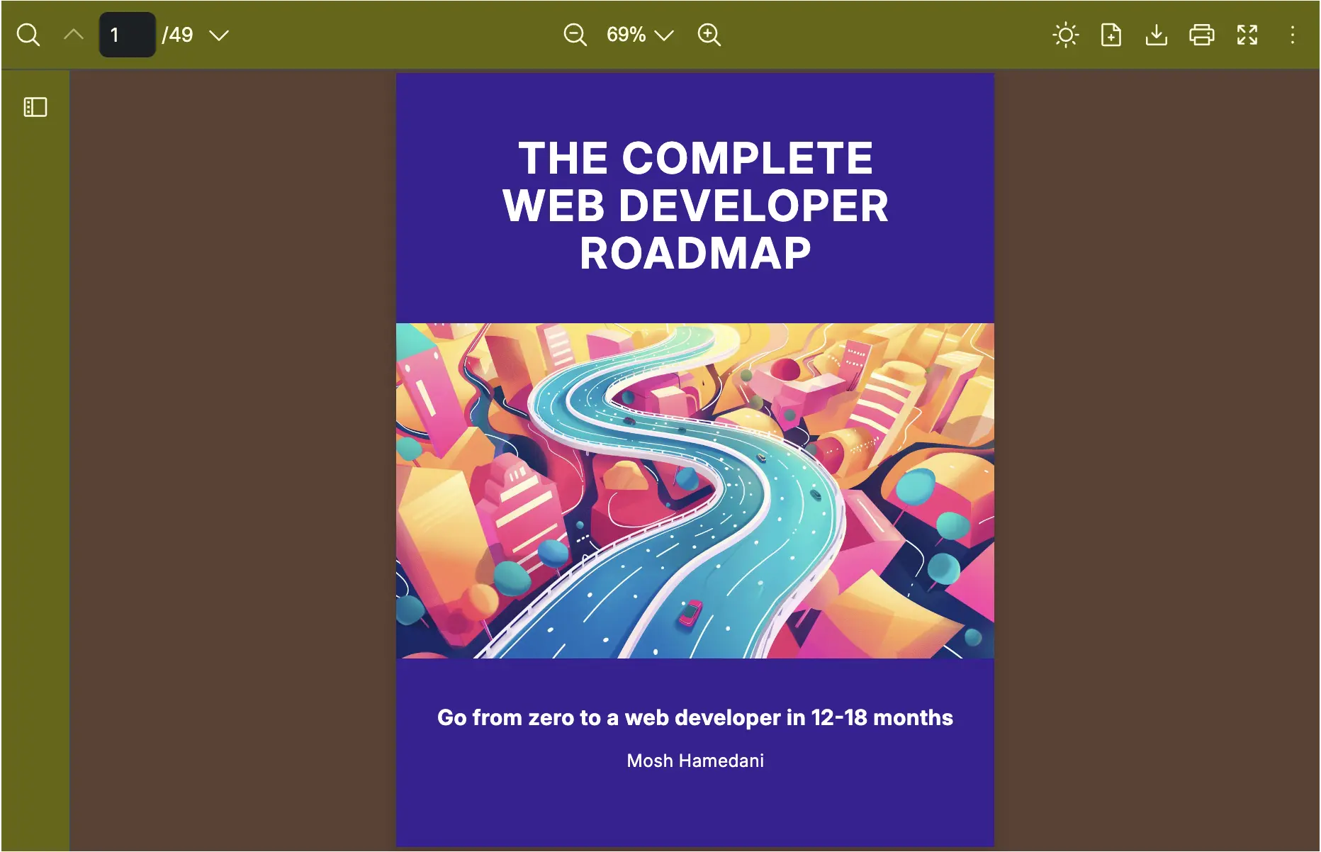
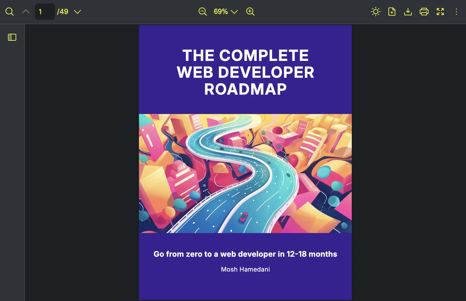
export const AppPdfViewer = () => { return ( <RPConfig> <RPTheme // Set your styles to the CSS variables customVariables={{ '--rp-text-color': '#666600', '--rp-toolbar-background': '#FFFFE0', '--rp-pages-background-color': '#F8F8FF', }} // Set your dark mode styles to the CSS variables customDarkVariables={{ '--rp-text-color': '#FFFFE0', '--rp-toolbar-background': '#666600', '--rp-pages-background-color': '#5C4033', }} > <RPProvider src="https://cdn.codewithmosh.com/image/upload/v1721763853/guides/web-roadmap.pdf"> <RPDefaultLayout> <RPPages /> </RPDefaultLayout> </RPProvider> </RPTheme> </RPConfig> )}After implementing this example, here’s the result:
Light Mode
Dark Mode
Changing the toolbar’s icon color by overriding the parent RPTheme
Section titled “Changing the toolbar’s icon color by overriding the parent RPTheme”- Create a
ParentPdfViewercomponent that passes theRPThemecomponent to its children.
import { RPConfig, RPTheme } from '@pdf-viewer/react'
export const ParentPdfViewer = ({ children }) => {  return (    <RPConfig>      <RPTheme        // Set your style to the CSS variable        customDarkVariables={{          '--rp-text-color': 'yellow'        }}      >        {{ children }}      </RPTheme>    </RPConfig>  )}
import { RPConfig, RPTheme } from '@pdf-viewer/react'import { PropsWithChildren } from 'react'
export const ParentPdfViewer: FC<PropsWithChildren> = ({ children }) => { return ( <RPConfig> <RPTheme // Set your style to the CSS variable customDarkVariables={{ '--rp-text-color': 'yellow' }} > {children} </RPTheme> </RPConfig> )}- Create a
ChildPdfViewercomponent that passes theParentPdfViewercomponent to its children.
import { RPTheme, RPDefaultLayout, RPPages, RPProvider } from '@pdf-viewer/react'import { ParentPdfViewer } from './ParentPdfViewer'
export const ChildPdfViewer = () => {  return (    <ParentPdfViewer>      <RPTheme        // Override the parent by setting your style to the CSS variable        customDarkVariables={{          '--rp-text-color': 'yellow'        }}      >        <RPProvider src="https://cdn.codewithmosh.com/image/upload/v1721763853/guides/web-roadmap.pdf">          <RPDefaultLayout>            <RPPages />          </RPDefaultLayout>        </RPProvider>      </RPTheme>    </ParentPdfViewer>  )}
import { RPTheme, RPDefaultLayout, RPPages, RPProvider } from '@pdf-viewer/react'import { ParentPdfViewer } from './ParentPdfViewer'
export const ChildPdfViewer = () => { return ( <ParentPdfViewer> <RPTheme // Override the parent by setting your style to the CSS variable customDarkVariables={{ '--rp-text-color': 'yellow' }} > <RPProvider src="https://cdn.codewithmosh.com/image/upload/v1721763853/guides/web-roadmap.pdf"> <RPDefaultLayout> <RPPages /> </RPDefaultLayout> </RPProvider> </RPTheme> </ParentPdfViewer> )}In the example above, the layout will read the variable --rp-text-color from the RPTheme component from the nearest parent component. As for the dark mode, the layout will read the variable --rp-text-color which is yellow from the RPTheme component.
Here’s the result after implementing this example code:
How to handle PDF Viewer’s appearance from that of the parent’s application
Section titled “How to handle PDF Viewer’s appearance from that of the parent’s application”React PDF is designed to function independently of the parent application’s appearance. However, you can control its theme using the darkMode prop, which can be managed via state.
Example Implementation
import { RPConfig, RPProvider, RPPages, RPDefaultLayout } from '@pdf-viewer/react'
// PDF Viewer component that supports light and dark modesexport const AppPdfViewer = ({ isDarkMode }) => {  return (    <RPConfig>      <RPProvider        src="https://cdn.codewithmosh.com/image/upload/v1721763853/guides/web-roadmap.pdf"        darkMode={isDarkMode}      >        <RPDefaultLayout>          <RPPages />        </RPDefaultLayout>      </RPProvider>    </RPConfig>  )}
import { RPConfig, RPProvider, RPPages, RPDefaultLayout } from '@pdf-viewer/react'
// PDF Viewer component that supports light and dark modesexport const AppPdfViewer = ({ isDarkMode }: { isDarkMode: boolean }) => { return ( <RPConfig> <RPProvider src="https://cdn.codewithmosh.com/image/upload/v1721763853/guides/web-roadmap.pdf" darkMode={isDarkMode} > <RPDefaultLayout> <RPPages /> </RPDefaultLayout> </RPProvider> </RPConfig> )}Parent Component
import { useState } from 'react'import { AppPdfViewer } from './AppPdfViewer'
function App() {  // State to manage light and dark mode  const [isDarkMode, setIsDarkMode] = useState(false)
  return (    <div className="container">      <button onClick={() => setIsDarkMode(!isDarkMode)}>{isDarkMode ? 'light' : 'dark'}</button>      <AppPdfViewer isDarkMode={isDarkMode} />    </div>  )}
import { useState } from 'react'import { AppPdfViewer } from './AppPdfViewer'
function App() { // State to manage light and dark mode const [isDarkMode, setIsDarkMode] = useState(false)
return ( <div className="container"> <button onClick={() => setIsDarkMode(!isDarkMode)}>{isDarkMode ? 'light' : 'dark'}</button> <AppPdfViewer isDarkMode={isDarkMode} /> </div> )}This approach allows you to toggle between light and dark themes dynamically while maintaining the viewer’s independence from the parent application’s styling.