Customize Toolbar (New) Beta
There are a few methods to customize the toolbar. Each method depends on your use case and how you want to use React PDF within your application:
- Partial Customization - Suitable for when you want to use tools, change or hide icons and modify slot within the default toolbar
- Full Customization - Suitable for when you want to use individual or new tools to your custom toolbar
Partial Customization
Section titled “Partial Customization”To use the default toolbar while still allowing customization of icons and slots, you can use RPHorizontalBar and RPVerticalBar components.
Use the Default Toolbar
Section titled “Use the Default Toolbar”You can apply RPHorizontalBar and RPVerticalBar components within RPLayout to use the default toolbar which is web responsive.
<RPConfig> <RPProvider src="YOUR_PDF_FILE"> <RPLayout toolbar={{ topbar: { component: <RPHorizontalBar /> }, leftSidebar: { component: <RPVerticalBar /> } }} > <RPPages /> </RPLayout> </RPProvider></RPConfig>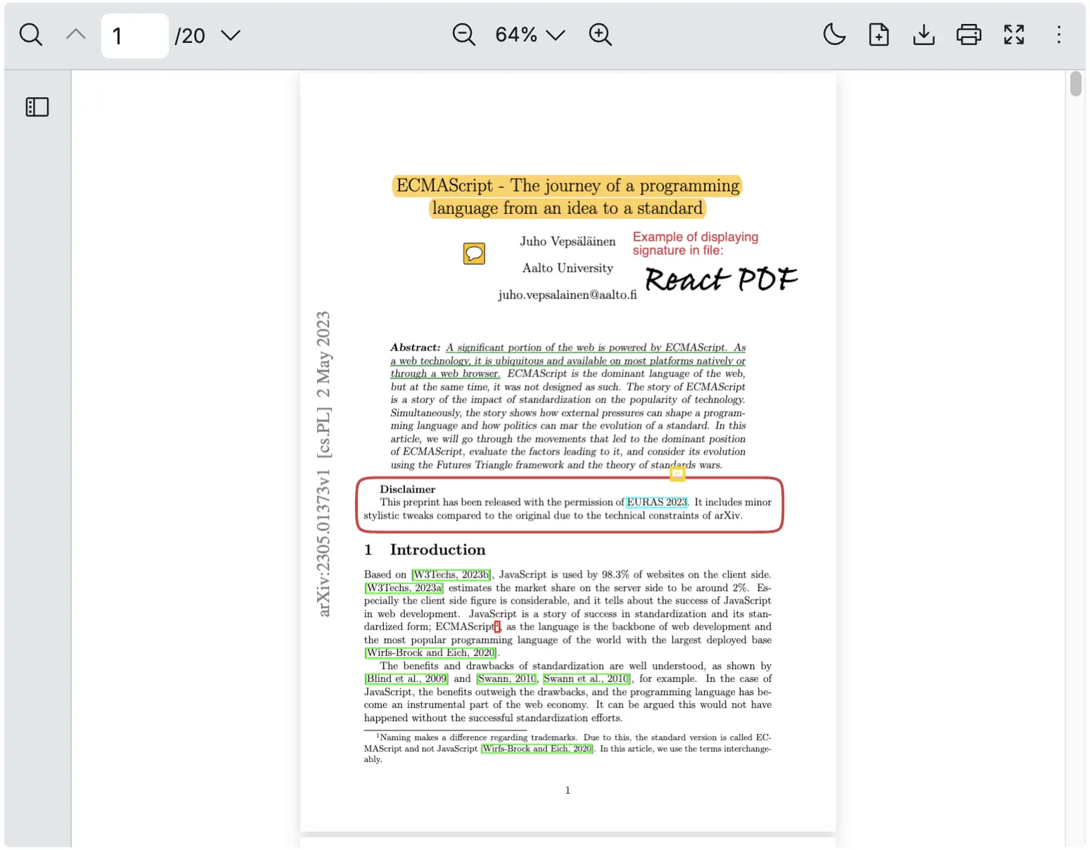
Use a Horizontal Bar for the Top Bar
Section titled “Use a Horizontal Bar for the Top Bar”You can just apply RPHorizontalBar component to the toolbar.
<RPConfig> <RPProvider src="YOUR_PDF_FILE"> <RPLayout toolbar={{ topbar: { component: <RPHorizontalBar /> } }} > <RPPages /> </RPLayout> </RPProvider></RPConfig>Change Visibility of Each Icon
Section titled “Change Visibility of Each Icon”You can easily control the visibility of the top bar icons in React PDF viewer by toggling their respective settings. Use the RPHorizontaBarlSlots prop to specify which icons should appear on the top bar.
Here’s how you can configure the top bar:
<RPConfig> <RPProvider src="YOUR_PDF_FILE"> <RPLayout toolbar={{ topbar: { component: ( <RPHorizontalBar slots={{ // Top bar: left searchTool: false, pageNavigationTool: false, // Top bar: center zoomTool: false, // Top bar: right themeSwitcher: false, openFileTool: false, downloadTool: false, printTool: false, fullscreenTool: false }} /> ) }, leftSidebar: { component: <></> } }} > <RPPages /> </RPLayout> </RPProvider></RPConfig>
Remark: An icon from left sidebar can be hidden the same way via RPVerticalBarSlots.
Replace Each Icon in the Toolbar
Section titled “Replace Each Icon in the Toolbar”For more details on how to change the icons in the default toolbar, refer to RPHorizontalBar and RPVerticalBar.
Full Customization
Section titled “Full Customization”In order to fully customize your toolbar, you will need to use individual tools within RPLayout.
Individual Tools
Section titled “Individual Tools”Each component within the default toolbar is exported individually, making them easy to import and use as needed. You can place them in either the top bar or the left sidebar.
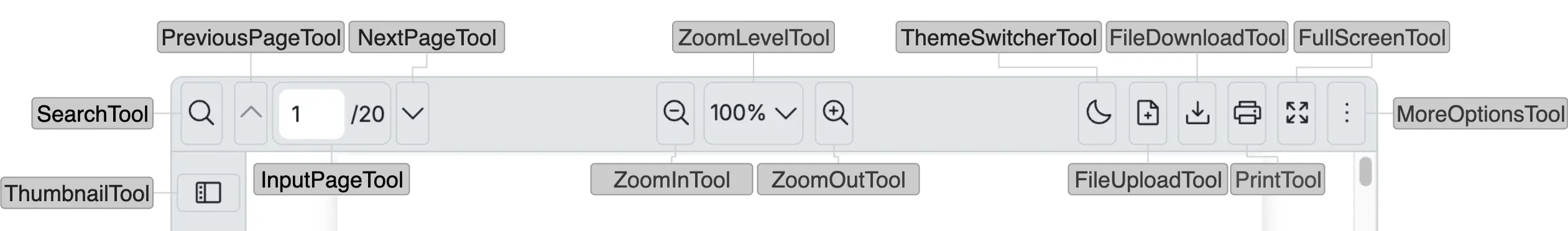
| Name | Type | Description |
|---|---|---|
| DocumentPropertiesTool | FC<ToolProps> | Display the PDF metadata such as title, author, page count and supports icon customization (Tool in More options) |
| DualPageTool | FC<ToolProps> | Display the dual page view mode and supports icon customization (Tool in More options) |
| FileDownloadTool | FC<ToolProps> | Allows downloading of the current PDF file and supports icon customization |
| FileUploadTool | FC<ToolProps> | Able to upload a new PDF file and supports icon customization |
| FullScreenTool | FC<ToolProps> | Displays the full screen mode for the viewer and supports icon customization |
| InputPageTool | FC | Displays the input page tool component and allows manual input of page number to navigate |
| NextPageTool | FC<ToolProps> | Navigate to the next page of the PDF and supports icon customization |
| PreviousPageTool | FC<ToolProps> | Navigate to the previous page of the PDF and supports icon customization |
| PrintTool | FC<ToolProps> | Displays print dialog to print the PDF document and supports icon customization |
| RotateClockwiseTool | FC<ToolProps> | Able to rotate the PDF page clockwise and supports icon customization (Tool in More options) |
| RotateCounterclockwiseTool | FC<ToolProps> | Able to rotate the PDF page counterclockwise and supports icon customization (Tool in More options) |
| SearchTool | FC<ToolProps> | Able to search for text inside the PDF document and supports icon customization |
| SelectionModeSwitcherTool | FC<SelectionModeSwitcherToolProps> | Displays the selection mode switcher tool component and allows to switch between text selection and hand tool mode and supports icon customization (Tool in More options) |
| SinglePageTool | FC<ToolProps> | Displays the single page view mode and supports icon customization (Tool in More options) |
| ThemeSwitcherTool | FC<ThemeSwitcherToolProps> | Displays the theme switcher tool component, toggles between light and dark themes and supports icon customization |
| ThumbnailTool | FC<ToolProps> | Shows thumbnail previews of all pages in the PDF and supports icon customization |
| ZoomInTool | FC<ToolProps> | Zooms into the PDF document view and supports icon customization |
| ZoomLevelTool | FC<ToolProps> | Displays and optionally selects current zoom level and supports icon customization |
| ZoomOutTool | FC<ToolProps> | Zooms out of the PDF document view and supports icon customization |
Rearrange Tools in the Toolbar
Section titled “Rearrange Tools in the Toolbar”In this example, you will see that each tool is independent and can be implemented across the toolbar
import { RPConfig, RPProvider, RPLayout, RPPages } from '@pdf-viewer/react'// Tool componentsimport {  SearchTool,  PreviousPageTool,  InputPageTool,  NextPageTool,  ZoomOutTool,  ZoomLevelTool,  ZoomInTool,  ThemeSwitcherTool,  FileUploadTool,  FileDownloadTool,  PrintTool,  FullScreenTool,  ThumbnailTool} from '@pdf-viewer/react'
const MyTopbar = () => {  return (    <>      <ThumbnailTool />      <PrintTool />      <FileUploadTool />      <div        style={{          marginLeft: 'auto'        }}      >        <ZoomOutTool />      </div>      <ZoomInTool />      <div        style={{          marginLeft: 'auto'        }}      />      <InputPageTool />    </>  )}
const MyLeftSidebar = () => {  return (    <>      <SearchTool />      <PreviousPageTool />      <NextPageTool />      <div        style={{          marginTop: 'auto'        }}      >        <ZoomOutTool />      </div>      <ZoomInTool />      <div        style={{          marginTop: 'auto'        }}      >        <ThemeSwitcherTool />      </div>      <FileDownloadTool />      <FullScreenTool />    </>  )}
const AppPdfViewer = () => {  return (    <RPConfig licenseKey="YOUR_LICENSE_KEY">      <RPProvider src="https://react-pdf-dev.github.io/react-pdf-viewer/assets/pdf/ECMAScript_annotated.pdf">        <RPLayout          style={{ height: 500 }}          toolbar={{            // Top Bar            topbar: {              component: <MyTopbar />            },            // Left sidebar            leftSidebar: {              component: <MyLeftSidebar />            }          }}        >          <RPPages />        </RPLayout>      </RPProvider>    </RPConfig>  )}
export default AppPdfViewer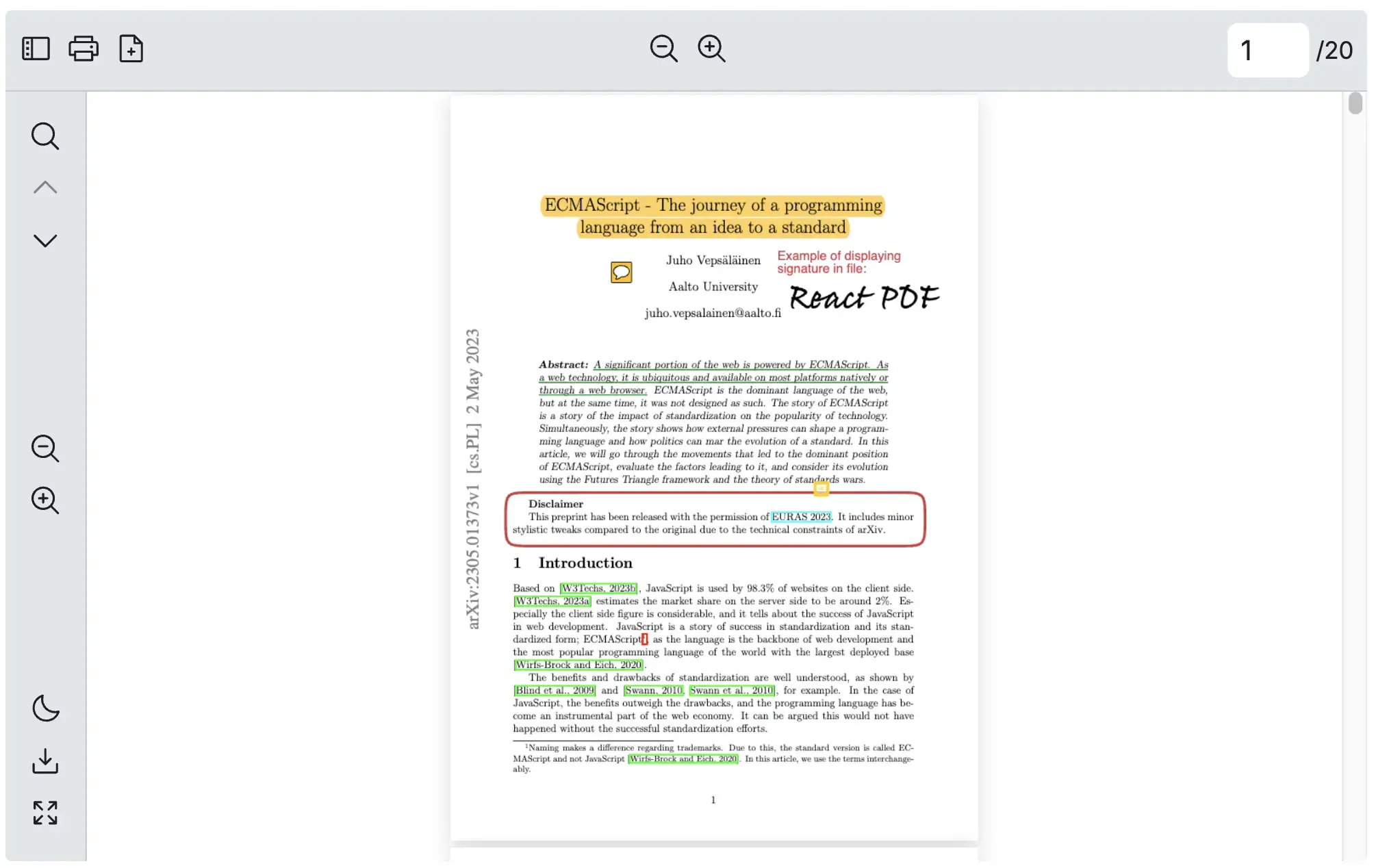
Change Any Icon of a Tool
Section titled “Change Any Icon of a Tool”This example can be applied to all individual tools that support the icon props.
import { RPConfig, RPProvider, RPLayout, RPPages, SearchTool } from '@pdf-viewer/react'
const HeartIcon = (  <svg xmlns="http://www.w3.org/2000/svg" width="24" height="24" fill="red" viewBox="0 0 24 24">    <path d="M12 21.35l-1.45-1.32C5.4 15.36 2 12.28 2 8.5 2 5.42 4.42 3 7.5 3c1.74 0 3.41 0.81 4.5 2.09 C13.09 3.81 14.76 3 16.5 3 19.58 3 22 5.42 22 8.5 c0 3.78-3.4 6.86-8.55 11.54L12 21.35z" />  </svg>)
const AppPdfViewer = () => {  return (    <RPConfig licenseKey="YOUR_LICENSE_KEY">      <RPProvider src="https://react-pdf-dev.github.io/react-pdf-viewer/assets/pdf/ECMAScript_annotated.pdf">        <RPLayout          toolbar={{            topbar: {              component: (                <>                  {/* Change an icon */}                  <SearchTool icon={HeartIcon} />                </>              )            }          }}        >          <RPPages />        </RPLayout>      </RPProvider>    </RPConfig>  )}
export default AppPdfViewer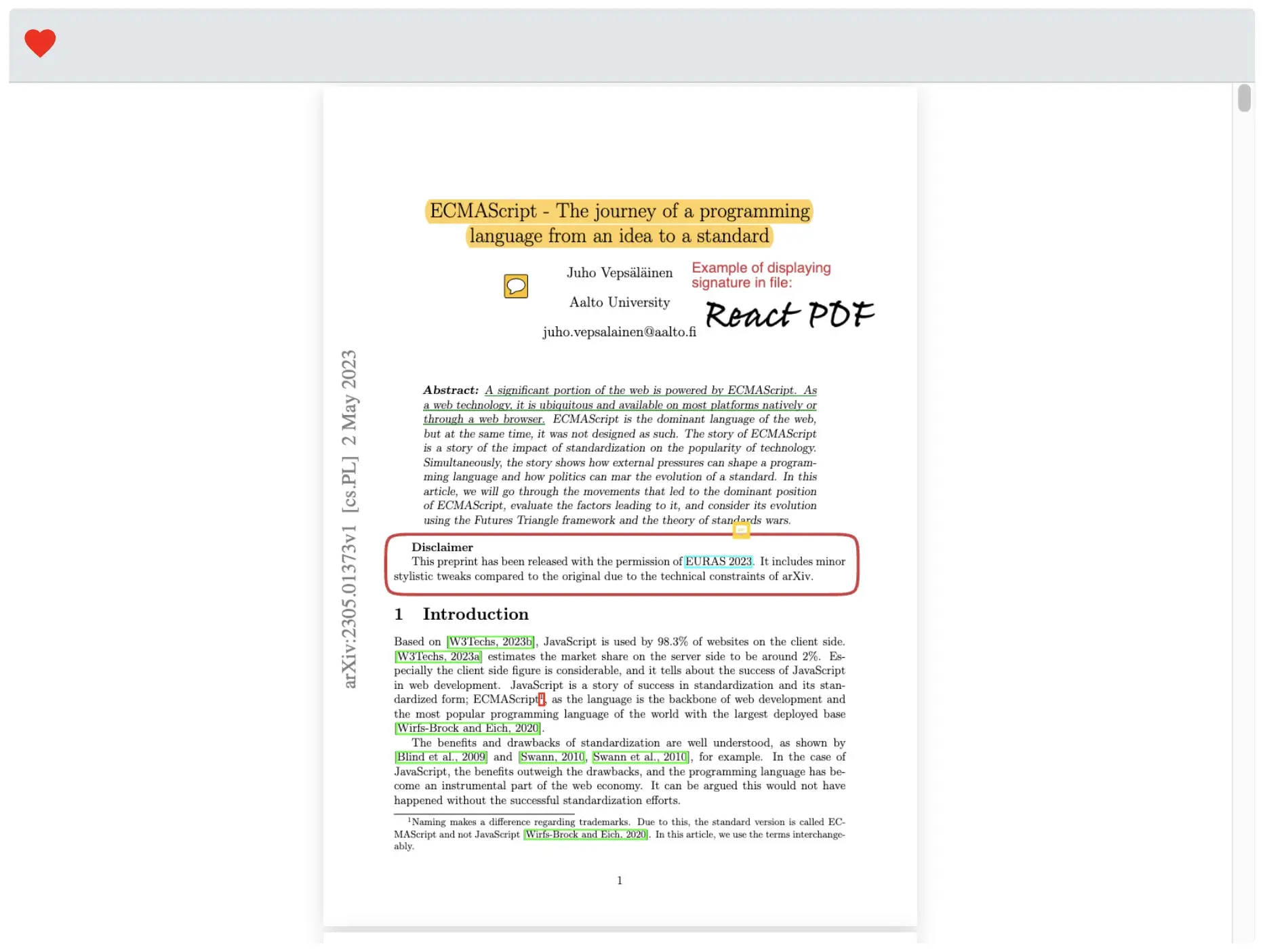
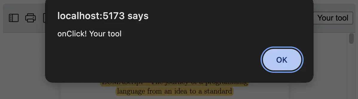
Add a Custom Tool in the Toolbar
Section titled “Add a Custom Tool in the Toolbar”Add the “Your tool” button to the toolbar.
import { RPConfig, RPProvider, RPLayout, RPPages } from '@pdf-viewer/react'// Tool componentsimport {  ThumbnailTool,  PrintTool,  FileUploadTool,  ZoomOutTool,  ZoomInTool,  InputPageTool} from '@pdf-viewer/react'
const MyTopbar = () => {  return (    <>      <ThumbnailTool />      <PrintTool />      <FileUploadTool />      <div        style={{          marginLeft: 'auto'        }}      >        <ZoomOutTool />      </div>      <ZoomInTool />      <div        style={{          marginLeft: 'auto'        }}      />      <InputPageTool />      {/* Your tool */}      <button onClick={() => alert('onClick! Your tool')}>Your tool</button>    </>  )}
const AppPdfViewer = () => {  return (    <RPConfig licenseKey="YOUR_LICENSE_KEY">      <RPProvider src="https://react-pdf-dev.github.io/react-pdf-viewer/assets/pdf/ECMAScript_annotated.pdf">        <RPLayout          toolbar={{            // Top Bar            topbar: {              component: <MyTopbar />            }          }}        >          <RPPages />        </RPLayout>      </RPProvider>    </RPConfig>  )}
export default AppPdfViewer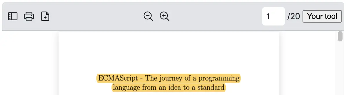
Hide the Toolbar
Section titled “Hide the Toolbar”To display the PDF Viewer without the toolbar, simply navigate to Hide Toolbar.