Customize Toolbar (RPLayout) Beta
RPLayout is a layout wrapper that allows users to easily compose a flexible and customizable PDF viewer interface. It supports the toolbar which consists of topbar and leftSidebar, where you can add, remove or shuffle tools around.
Key Features
Section titled “Key Features”- Fully customizable by passing your own React elements into the layout
- Tool Components are flexible, you can place them in either the top bar or the left sidebar as needed
- Responsive support via
onLayoutWidthChangeon RPLayout, provides the current width of the viewer layout to help handle web responsiveness
In order to take full advantage of the customization options of the toolbar, we should first explain on the RPLayout structure in React PDF.
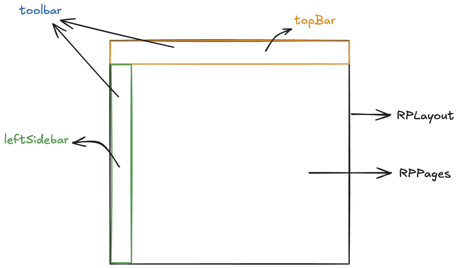
Each part of the toolbar can be separated, allowing only the topBar or the leftSidebar to be displayed. Tools can be placed in any part of the toolbar and arranged freely.
The toolbar can displayed both the topBar and the leftSidebar at the same time.
For an overview concept and available configuration options, check out the RPLayout component.
Rearrange Tools in the Toolbar
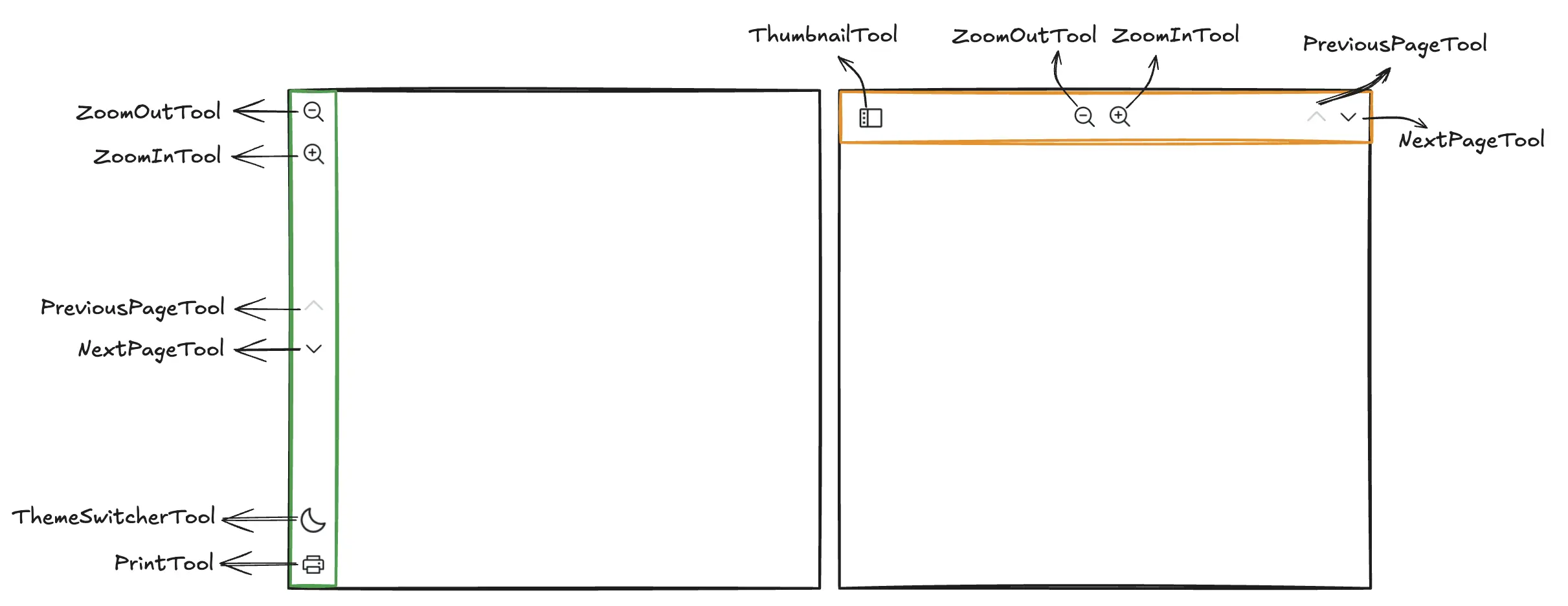
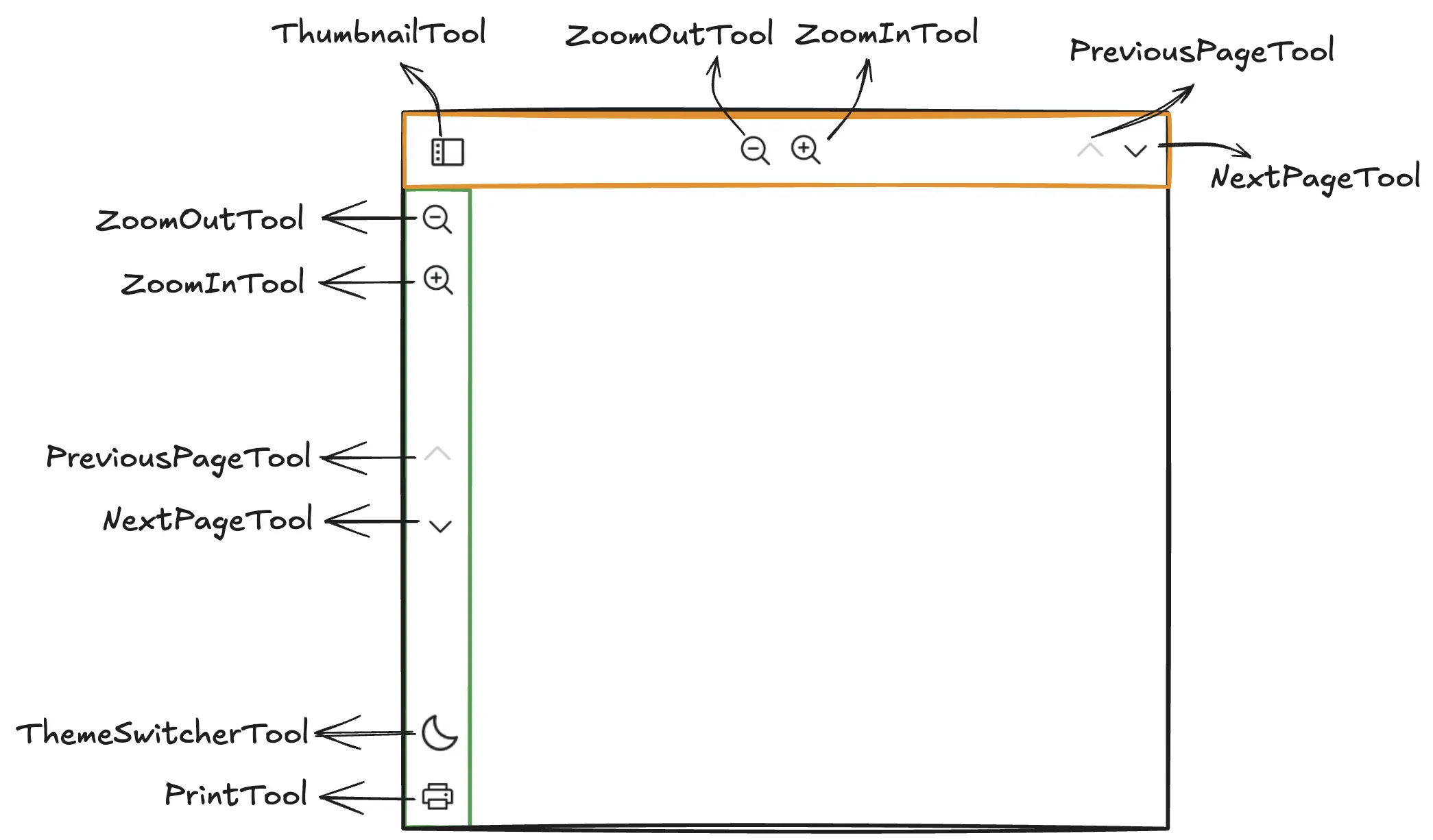
Section titled “Rearrange Tools in the Toolbar”In this example, you will see that each tool is independent and can be implemented across the top bar and left sidebar.
import { RPConfig, RPProvider, RPLayout, RPPages } from '@pdf-viewer/react'// Tool componentsimport {  SearchTool,  PreviousPageTool,  InputPageTool,  NextPageTool,  ZoomOutTool,  ZoomLevelTool,  ZoomInTool,  ThemeSwitcherTool,  FileUploadTool,  FileDownloadTool,  PrintTool,  FullScreenTool,  ThumbnailTool} from '@pdf-viewer/react'
const MyTopbar = () => {  return (    <>      <ThumbnailTool />      <PrintTool />      <FileUploadTool />      <div        style={{          marginLeft: 'auto'        }}      >        <ZoomOutTool />      </div>      <ZoomInTool />      <div        style={{          marginLeft: 'auto'        }}      />      <InputPageTool />    </>  )}
const MyLeftSidebar = () => {  return (    <>      <SearchTool />      <PreviousPageTool />      <NextPageTool />      <div        style={{          marginTop: 'auto'        }}      >        <ZoomOutTool />      </div>      <ZoomInTool />      <div        style={{          marginTop: 'auto'        }}      >        <ThemeSwitcherTool />      </div>      <FileDownloadTool />      <FullScreenTool />    </>  )}
const AppPdfViewer = () => {  return (    <RPConfig licenseKey={'YOUR_LICENSE_KEY'}>      <RPProvider src="https://cdn.codewithmosh.com/image/upload/v1721763853/guides/web-roadmap.pdf">        <RPLayout          style={{ height: 500 }}          toolbar={{            // Top Bar            topbar: {              component: <MyTopbar />            },            // Left sidebar            leftSidebar: {              component: <MyLeftSidebar />            }          }}        >          <RPPages />        </RPLayout>      </RPProvider>    </RPConfig>  )}
export default AppPdfViewer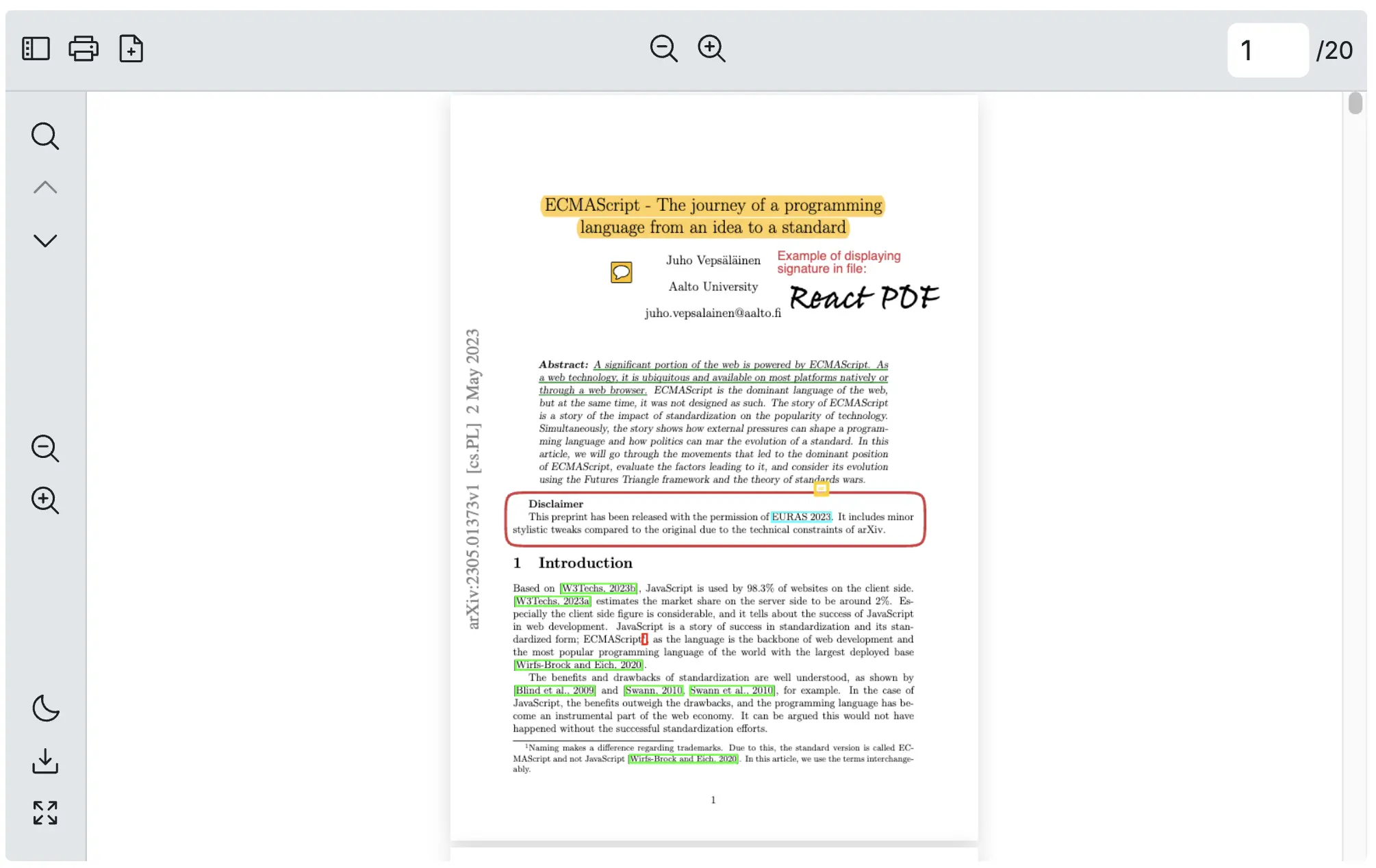
Change Any Icon of a Tool
Section titled “Change Any Icon of a Tool”This example can be applied to all tool components that support the icon props.
import { RPConfig, RPProvider, RPLayout, RPPages, SearchTool } from '@pdf-viewer/react'
const HeartIcon = (  <svg xmlns="http://www.w3.org/2000/svg" width="24" height="24" fill="red" viewBox="0 0 24 24">    <path d="M12 21.35l-1.45-1.32C5.4 15.36 2 12.28 2 8.5 2 5.42 4.42 3 7.5 3c1.74 0 3.41 0.81 4.5 2.09 C13.09 3.81 14.76 3 16.5 3 19.58 3 22 5.42 22 8.5 c0 3.78-3.4 6.86-8.55 11.54L12 21.35z" />  </svg>)
const AppPdfViewer = () => {  return (    <RPConfig licenseKey={'YOUR_LICENSE_KEY'}>      <RPProvider src="https://cdn.codewithmosh.com/image/upload/v1721763853/guides/web-roadmap.pdf">        <RPLayout          toolbar={{            topbar: {              component: (                <>                  {/* Change an icon */}                  <SearchTool icon={HeartIcon} />                </>              )            }          }}        >          <RPPages />        </RPLayout>      </RPProvider>    </RPConfig>  )}
export default AppPdfViewer
Hide the Toolbar
Section titled “Hide the Toolbar”To show the PDF Viewer without the toolbar, this can be done easily by omitting the toolbar prop.
import { RPConfig, RPProvider, RPLayout, RPPages } from '@pdf-viewer/react'
const AppPdfViewer = () => {  return (    <RPConfig licenseKey={'YOUR_LICENSE_KEY'}>      <RPProvider src="https://cdn.codewithmosh.com/image/upload/v1721763853/guides/web-roadmap.pdf">        <RPLayout        // Hiding the toolbar        // toolbar={{}}        >          <RPPages />        </RPLayout>      </RPProvider>    </RPConfig>  )}
export default AppPdfViewer
Controlling the Viewer with React Hooks
Section titled “Controlling the Viewer with React Hooks”Certain tools within the toolbar and the More Options menu expose a React Context API, enabling advanced control and customization. These APIs allow users to interact with and modify the behavior of specific tools directly from the parent component.
The methods are exposed through React’s hooks and can be accessed via a ref in the parent component. This setup allows users to dynamically trigger actions, such as adjusting zoom levels, toggling visibility, or navigating pages. For a detailed list of available configuration options, refer to the Hooks documentation.
Adding a Custom Button directly on the toolbar
Section titled “Adding a Custom Button directly on the toolbar”The toolbar accepts components, which means you have full flexibility to arrange, modify, or reorder its components however you like.
Example: Add a Button to Toolbar and Show the Document Properties
Section titled “Example: Add a Button to Toolbar and Show the Document Properties”React PDF provides a useDocumentContext through its React Context API, enabling you to know what properties a PDF file currently has.
Here is a simple button example that will help you place a button on your toolbar. When you click on the button, it will show the Document properties.
import {  RPConfig,  RPProvider,  RPLayout,  RPPages,  SearchTool,  PreviousPageTool,  InputPageTool,  NextPageTool,  ThumbnailTool,  useDocumentContext} from '@pdf-viewer/react'
const DocumentPropertiesButton = () => {  const { pdfProperties } = useDocumentContext()
  return (    <div style={{ marginInline: '8px' }}>      <button onClick={() => alert(`${JSON.stringify(pdfProperties, null, 2)}`)}>        Alert Document properties      </button>    </div>  )}
const AppPdfViewer = () => {  return (    <RPConfig>      <RPProvider        src={'https://cdn.codewithmosh.com/image/upload/v1721763853/guides/web-roadmap.pdf'}      >        <RPLayout          toolbar={{            topbar: {              component: (                <>                  <SearchTool />                  <PreviousPageTool />                  <InputPageTool />                  <NextPageTool />                  <DocumentPropertiesButton />                </>              )            },            leftSidebar: {              component: <ThumbnailTool />            }          }}        >          <RPPages />        </RPLayout>      </RPProvider>    </RPConfig>  )}
export default AppPdfViewer

Adding a Custom Button in a Parent Component
Section titled “Adding a Custom Button in a Parent Component”With the React Context API, you can invoke key features like rotating pages, zooming, or navigating through the document without relying solely on the viewer’s built-in UI. This approach is particularly useful for users who need to customize specific designs or meet unique usability requirements.
Example: Add an External Button to Rotate PDF
Section titled “Example: Add an External Button to Rotate PDF”React PDF provides a useRotationContext hook, enabling you to control page rotation from outside the viewer. This flexibility allows you to integrate rotation controls into custom buttons or external components, making the viewer adaptable to your application’s needs.
import {  useRotationContext,  RPConfig,  RPProvider,  RPLayout,  RPPages} from "@pdf-viewer/react";
const CustomRotationLayout = () => {  // Access the rotation control from the context  const { rotate, setRotate } = useRotationContext();
  // Rotate 90 degrees in a clockwise direction  const handleRotateClockwise = () => {    setRotate((prev) => (prev + 90) % 360);  };
  // Rotate 90 degrees in a counterclockwise direction  const handleRotateCounterclockwise = () => {    setRotate((prev) => (prev - 90 + 360) % 360);  };
  return (    <div>      {rotate} degrees      <br />      <button onClick={handleRotateClockwise}>Rotate Clockwise</button>      <br />      <button onClick={handleRotateCounterclockwise}>        Rotate Counterclockwise      </button>    </div>  );};
export const AppPdfViewer = () => {  return (    <RPConfig>      <RPProvider src="https://cdn.codewithmosh.com/image/upload/v1721763853/guides/web-roadmap.pdf">        <CustomRotationLayout/>        <RPLayout          style={{ width: "100%", height: "550px" }}        >          <RPPages />        </RPLayout>      </RPProvider>    </RPConfig>  );};
import { useRotationContext, RPConfig, RPProvider, RPLayout, RPPages} from "@pdf-viewer/react";import { type FC } from "react";
const CustomRotationLayout: FC = () => { // Access the rotation control from the context const { rotate, setRotate } = useRotationContext();
// Rotate 90 degrees in a clockwise direction const handleRotateClockwise = () => { setRotate((prev) => (prev + 90) % 360); };
// Rotate 90 degrees in a counterclockwise direction const handleRotateCounterclockwise = () => { setRotate((prev) => (prev - 90 + 360) % 360); };
return ( <div> {rotate} degrees <br /> <button onClick={handleRotateClockwise}>Rotate Clockwise</button> <br /> <button onClick={handleRotateCounterclockwise}> Rotate Counterclockwise </button> </div> );};
export const AppPdfViewer : FC = () => { return ( <RPConfig> <RPProvider src="https://cdn.codewithmosh.com/image/upload/v1721763853/guides/web-roadmap.pdf"> <CustomRotationLayout/> <RPLayout style={{ width: "100%", height: "550px" }} > <RPPages /> </RPLayout> </RPProvider> </RPConfig> );};