Add a Custom Action to a Highlighted Element
Scenario
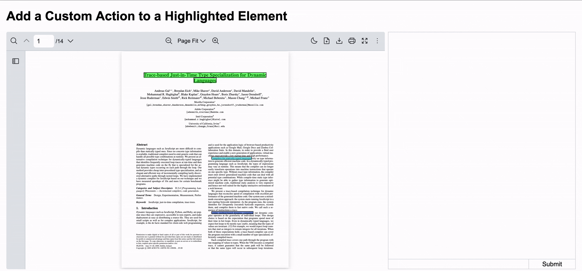
Section titled “Scenario”This example demonstrates how to add a custom action to a highlighted element in a React PDF Viewer component.
When keywords are programmatically highlighted in the PDF document, users can click on any highlighted element, allowing React PDF to trigger any custom behavior (copy, annotate, comment, etc.).
- Copy the highlighted text
- Create references or bookmarks
- Trigger custom workflows on the highlighted content
In this instance, the popover provides two actions:
- Copy: Copies the highlighted text to the clipboard
- Explain: Sends the highlighted text to a chat interface for AI-powered explanation
What to Use
Section titled “What to Use”Below are functions and values extracted from hooks provided by @pdf-viewer/react to create custom actions for highlighted elements:
| Name | Source Hook | Objective |
|---|---|---|
| highlight | useHighlightContext | Programmatically highlight keywords once the document is loaded |
| highlightMatches | useHighlightContext | Access all matched highlights with their positions, text content, and page information |
| updateElement | useElementPageContext | Add custom React elements to specific PDF pages |
| clearElements | useElementPageContext | Remove all custom elements from a specific page |
| currentZoom | useZoomContext | Get the current zoom level for accurate positioning of custom elements |
Note This example uses
react-markdownto render chat responses. Make sure it is installed before running the example.
To make the chat experience smooth, you’ll need to create the following 4 components and 1 custom hook:
-
Create a custom hook which renders clickable overlays on highlighted areas and manages the popover state
useRenderHighlights.jsx import { useElementPageContext, useHighlightContext, useZoomContext } from '@pdf-viewer/react'import { Dispatch, ReactElement, SetStateAction, useCallback, useEffect, useState } from 'react'import { SelectDropDown } from './SelectDropDown'export const useRenderHighlights = ({ onAsk, onCopy, setSelectedText }) => {const { currentZoom } = useZoomContext()const { highlightMatches, highlight } = useHighlightContext()const { updateElement, clearElements } = useElementPageContext()const [isShowPopover, setIsShowPopover] = useState(false)const [activeIndex, setActiveIndex] = useState(null)const handleShowPopover = () => {setIsShowPopover((prev) => !prev)}const handleHidePopover = () => {setIsShowPopover(false)}const handleAsk = useCallback(() => {onAsk()handleHidePopover()}, [onAsk, handleHidePopover])const handleCopy = useCallback(() => {onCopy()handleHidePopover()}, [onCopy, handleHidePopover])useEffect(() => {const highlightMatchesByPage = highlightMatches.reduce((map, matchHighlight) => {const pageHighlights = map.get(matchHighlight.page) ?? []return map.set(matchHighlight.page, [...pageHighlights, matchHighlight])}, new Map())highlightMatchesByPage.forEach((matchHighlights, page) => {const elements = []matchHighlights.forEach((matchHighlight) => {const rects = matchHighlight.rects ?? [matchHighlight.rect]rects.forEach((rect, index) => {const isLastRect = (index + 1) === rects.lengthelements.push(<><divid={`${matchHighlight.oIndex}`}key={`${page}-${index}`}style={{left: rect.left * currentZoom,bottom: rect.bottom * currentZoom,width: rect.width * currentZoom,height: rect.height * currentZoom,position: 'absolute',border: '1px solid rgba(0, 0, 0)',cursor: 'pointer',zIndex: 10}}onClick={() => {handleShowPopover()setActiveIndex(matchHighlight.oIndex)setSelectedText(matchHighlight.str.toString() ?? '')}}/>{isLastRect && (<SelectDropDownposition={{x: (rect.left * currentZoom) + (rect.width * currentZoom),y: (rect.bottom * currentZoom) - 55}}show={isShowPopover && activeIndex === matchHighlight.oIndex}onAsk={handleAsk}onCopy={handleCopy}/>)}</>)})})if (elements.length > 0) {updateElement(page, (prevElements = []) => [...prevElements, ...elements])}})return () => highlightMatchesByPage.forEach((_, page) => clearElements(page))}, [currentZoom, highlightMatches, updateElement, clearElements, highlight, isShowPopover])}useRenderHighlights.tsx import { MatchHighlight, useElementPageContext, useHighlightContext, useZoomContext } from '@pdf-viewer/react'import { Dispatch, ReactElement, SetStateAction, useCallback, useEffect, useState } from 'react'import { SelectDropDown } from './SelectDropDown'interface UseRenderHighlightsProps {onAsk: () => void;onCopy: () => void;setSelectedText: Dispatch<SetStateAction<string>>;}export const useRenderHighlights = ({ onAsk, onCopy, setSelectedText }: UseRenderHighlightsProps) => {const { currentZoom } = useZoomContext()const { highlightMatches, highlight } = useHighlightContext()const { updateElement, clearElements } = useElementPageContext()const [isShowPopover, setIsShowPopover] = useState(false)const [activeIndex, setActiveIndex] = useState<number | null>(null)const handleShowPopover = () => {setIsShowPopover((prev) => !prev)}const handleHidePopover = () => {setIsShowPopover(false)}const handleAsk = useCallback(() => {onAsk()handleHidePopover()}, [onAsk, handleHidePopover])const handleCopy = useCallback(() => {onCopy()handleHidePopover()}, [onCopy, handleHidePopover])useEffect(() => {const highlightMatchesByPage = highlightMatches.reduce((map, matchHighlight) => {const pageHighlights = map.get(matchHighlight.page) ?? []return map.set(matchHighlight.page, [...pageHighlights, matchHighlight])}, new Map<number, MatchHighlight[]>())highlightMatchesByPage.forEach((matchHighlights, page) => {const elements: ReactElement[] = []matchHighlights.forEach((matchHighlight: MatchHighlight) => {const rects = matchHighlight.rects ?? [matchHighlight.rect]rects.forEach((rect, index) => {const isLastRect = (index + 1) === rects.lengthelements.push(<><divid={`${matchHighlight.oIndex}`}key={`${page}-${index}`}style={{left: rect.left * currentZoom,bottom: rect.bottom * currentZoom,width: rect.width * currentZoom,height: rect.height * currentZoom,position: 'absolute',border: '1px solid rgba(0, 0, 0)',cursor: 'pointer',zIndex: 10}}onClick={() => {handleShowPopover()setActiveIndex(matchHighlight.oIndex)setSelectedText(matchHighlight.str.toString() ?? '')}}/>{isLastRect && (<SelectDropDownposition={{x: (rect.left * currentZoom) + (rect.width * currentZoom),y: (rect.bottom * currentZoom) - 55}}show={isShowPopover && activeIndex === matchHighlight.oIndex}onAsk={handleAsk}onCopy={handleCopy}/>)}</>)})})if (elements.length > 0) {updateElement(page, (prevElements = []) => [...prevElements, ...elements])}})return () => highlightMatchesByPage.forEach((_, page) => clearElements(page))}, [currentZoom, highlightMatches, updateElement, clearElements, highlight, isShowPopover])} -
Create a select dropdown component to display the action buttons as a popover
SelectDropDown.jsx import { useCallback } from "react";export const SelectDropDown = ({position,show,onAsk,onCopy,}) => {const handleAsk = useCallback(() => {onAsk();}, [onAsk]);const handleCopy = useCallback(() => {onCopy();}, [onCopy]);if (!show) return null;return (<divclassName="absolute"style={{left: position.x,bottom: position.y,zIndex: 1000,}}><ul className="bg-white border border-gray-200 rounded-md p-2"><li className="cursor-pointer hover:bg-gray-100" onClick={handleCopy}>Copy</li><li className="cursor-pointer hover:bg-gray-100" onClick={handleAsk}>Explain</li></ul></div>);};SelectDropDown.tsx import { useCallback } from "react";interface SelectDropDownProps {position: {x: number;y: number;};show: boolean;onAsk: () => void;onCopy: () => void;}export const SelectDropDown = ({position,show,onAsk,onCopy,}: SelectDropDownProps) => {const handleAsk = useCallback(() => {onAsk();}, [onAsk]);const handleCopy = useCallback(() => {onCopy();}, [onCopy]);if (!show) return null;return (<divclassName="absolute"style={{left: position.x,bottom: position.y,zIndex: 1000,}}><ul className="bg-white border border-gray-200 rounded-md p-2"><li className="cursor-pointer hover:bg-gray-100" onClick={handleCopy}>Copy</li><li className="cursor-pointer hover:bg-gray-100" onClick={handleAsk}>Explain</li></ul></div>);}; -
Create a select dropdown wrapper to handle the highlighting logic and integrate with the custom highlight renderer
SelectDropDownWrapper.jsx import { useHighlightContext } from "@pdf-viewer/react";import { useCallback, useEffect, useState } from "react";import { useRenderHighlights } from "./useRenderHighlights";export const SelectDropDownWrapper = ({ pdfViewer, setContext }) => {const { highlight } = useHighlightContext()const [selectedText, setSelectedText] = useState("");useEffect(() => {highlight([{keyword: 'Trace-based Just-in-Time Type Specialization for Dynamic Languages',highlightColor: 'rgba(0, 255, 0, 0.5)',options: { matchCase: true, wholeWords: true }},{keyword: 'Compilers for statically typed languages',highlightColor: 'rgba(0, 245, 255, 0.5)',},{keyword: 'Unlike method-based dynamic compilers',highlightColor: 'rgba(0, 55, 195, 0.5)',},])}, [])const handleAsk = useCallback(() => {setContext(selectedText);}, [selectedText]);const handleCopy = useCallback(() => {if (selectedText) {window.navigator.clipboard.writeText(selectedText);}}, [selectedText]);useRenderHighlights({ onAsk: handleAsk, onCopy: handleCopy, setSelectedText })return (<></>)}SelectDropDownWrapper.tsx import { useHighlightContext } from "@pdf-viewer/react";import { FC, useCallback, useEffect, useState } from "react";import { useRenderHighlights } from "./useRenderHighlights";export const SelectDropDownWrapper: FC<{ pdfViewer?: HTMLDivElement | null, setContext: (context: string) => void }> = ({ pdfViewer, setContext }) => {const { highlight } = useHighlightContext()const [selectedText, setSelectedText] = useState<string>("");useEffect(() => {highlight([{keyword: 'Trace-based Just-in-Time Type Specialization for Dynamic Languages',highlightColor: 'rgba(0, 255, 0, 0.5)',options: { matchCase: true, wholeWords: true }},{keyword: 'Compilers for statically typed languages',highlightColor: 'rgba(0, 245, 255, 0.5)',},{keyword: 'Unlike method-based dynamic compilers',highlightColor: 'rgba(0, 55, 195, 0.5)',},])}, [])const handleAsk = useCallback(() => {setContext(selectedText);}, [selectedText]);const handleCopy = useCallback(() => {if (selectedText) {window.navigator.clipboard.writeText(selectedText);}}, [selectedText]);useRenderHighlights({ onAsk: handleAsk, onCopy: handleCopy, setSelectedText })return (<></>)} -
Create an input chat component that displays the highlighted context and allows users to submit questions
InputChat.jsx import { useCallback, Ref, useRef } from "react";export const Input = ({ref,onSubmit,context,onClearContext,}) => {const inputRef = useRef(null);const handleSubmit = useCallback(() => {const textValue = inputRef.current?.innerText;if (onSubmit && textValue) {onSubmit(textValue);inputRef.current!.innerText = "";}}, [onSubmit]);const handleKeyDown = useCallback((e) => {// If pressed Enter only, it will send the question to the server.// Allow new line by pressing Shift + Enterif (e.key === "Enter" && !e.shiftKey) {e.preventDefault();handleSubmit();}},[handleSubmit]);return (<div ref={ref}>{context && (<div className="text-sm border-t border-gray-300 px-2"><div className="flex justify-between">Ask about:{" "}<span onClick={onClearContext} className="cursor-pointer">X</span></div><div className="text-gray-500">{context}</div></div>)}<div className="flex border-t border-gray-300"><pref={inputRef}className="w-3/4"contentEditablesuppressContentEditableWarningonKeyDown={handleKeyDown}></p><buttononClick={handleSubmit}className="w-1/4 border-l border-gray-300">Submit</button></div></div>);};InputChat.tsx import { useCallback, Ref, useRef } from "react";export const Input = ({ref,onSubmit,context,onClearContext,}: InputProps) => {const inputRef = useRef<HTMLDivElement>(null);const handleSubmit = useCallback(() => {const textValue = inputRef.current?.innerText;if (onSubmit && textValue) {onSubmit(textValue);inputRef.current!.innerText = "";}}, [onSubmit]);const handleKeyDown = useCallback((e: React.KeyboardEvent<HTMLInputElement>) => {// If pressed Enter only, it will send the question to the server.// Allow new line by pressing Shift + Enterif (e.key === "Enter" && !e.shiftKey) {e.preventDefault();handleSubmit();}},[handleSubmit]);return (<div ref={ref}>{context && (<div className="text-sm border-t border-gray-300 px-2"><div className="flex justify-between">Ask about:{" "}<span onClick={onClearContext} className="cursor-pointer">X</span></div><div className="text-gray-500">{context}</div></div>)}<div className="flex border-t border-gray-300"><pref={inputRef}className="w-3/4"contentEditablesuppressContentEditableWarningonKeyDown={handleKeyDown}></p><buttononClick={handleSubmit}className="w-1/4 border-l border-gray-300">Submit</button></div></div>);}; -
Create a chat component to receive the highlighted text for explanation
Chat.jsx import { useCallback, useEffect, useRef, useState } from "react";import { Input } from "./Input";import Markdown from "react-markdown";// Message item for question and answerconst Item = ({type,content,}: {type: "question" | "answer";content: string;}) => {return (<divclassName={`flex ${type === "question" ? "justify-end" : "justify-start"} w-full`}><divclassName={`px-2 max-w-2/3 my-2 py-1 rounded ${type === "question" ? "bg-neutral-200" : "bg-neutral-400"}`}>{/* Render markdown content that will be received from AI */}<Markdown>{content}</Markdown></div></div>);};interface ChatProps {context?: string;onClearContext?: () => void;}export const Chat = ({ context, onClearContext }: ChatProps) => {const [inputRef, setInputRef] = useState<HTMLDivElement | null>(null);const [messages, setMessages] = useState<{ id: string; type: "question" | "answer"; content: string }[]>([]);const [loading, setLoading] = useState(false);const messageRef = useRef<string>("");const currentMessageIndexRef = useRef<number>(0);const [conversationHeight, setConversationHeight] = useState<string>("600px");useEffect(() => {if (!inputRef) return;const observer = new ResizeObserver((entries) => {setConversationHeight(`calc(600px - ${entries[0].contentRect.height}px)`);});observer.observe(inputRef);return () => {observer.disconnect();};}, [inputRef]);const handleSubmit = useCallback(async (value: string) => {setLoading(true);messageRef.current = "";setMessages((prev) => {// Set message index to be appended when the answer is receivedcurrentMessageIndexRef.current = prev.length + 1;return [...prev,{ id: Date.now().toString(), type: "question", content: value },];});if (onClearContext) {onClearContext();}// Your backend endpoint},[context, onClearContext]);return (<div className="h-150 relative border border-gray-300"><divclassName="overflow-y-auto"style={{height: conversationHeight,}}><div className="p-1">{messages.map((ele) => (<Item key={ele.id} type={ele.type} content={ele.content} />))}</div></div>{/* Avoid rerender when input height change due to new line */}<div className="absolute bottom-0 w-full"><Inputcontext={context}onSubmit={handleSubmit}onClearContext={onClearContext}ref={setInputRef}/></div></div>);};Chat.tsx import { useCallback, useEffect, useRef, useState } from "react";import { Input } from "./Input";import Markdown from "react-markdown";// Message item for question and answerconst Item = ({type,content,}: {type: "question" | "answer";content: string;}) => {return (<divclassName={`flex ${type === "question" ? "justify-end" : "justify-start"} w-full`}><divclassName={`px-2 max-w-2/3 my-2 py-1 rounded ${type === "question" ? "bg-neutral-200" : "bg-neutral-400"}`}>{/* Render markdown content that will be received from AI */}<Markdown>{content}</Markdown></div></div>);};interface ChatProps {context?: string;onClearContext?: () => void;}export const Chat = ({ context, onClearContext }: ChatProps) => {const [inputRef, setInputRef] = useState<HTMLDivElement | null>(null);const [messages, setMessages] = useState<{ id: string; type: "question" | "answer"; content: string }[]>([]);const [loading, setLoading] = useState(false);const messageRef = useRef<string>("");const currentMessageIndexRef = useRef<number>(0);const [conversationHeight, setConversationHeight] = useState<string>("600px");useEffect(() => {if (!inputRef) return;const observer = new ResizeObserver((entries) => {setConversationHeight(`calc(600px - ${entries[0].contentRect.height}px)`);});observer.observe(inputRef);return () => {observer.disconnect();};}, [inputRef]);const handleSubmit = useCallback(async (value: string) => {setLoading(true);messageRef.current = "";setMessages((prev) => {// Set message index to be appended when the answer is receivedcurrentMessageIndexRef.current = prev.length + 1;return [...prev,{ id: Date.now().toString(), type: "question", content: value },];});if (onClearContext) {onClearContext();}// Your backend endpoint},[context, onClearContext]);return (<div className="h-150 relative border border-gray-300"><divclassName="overflow-y-auto"style={{height: conversationHeight,}}><div className="p-1">{messages.map((ele) => (<Item key={ele.id} type={ele.type} content={ele.content} />))}</div></div>{/* Avoid rerender when input height change due to new line */}<div className="absolute bottom-0 w-full"><Inputcontext={context}onSubmit={handleSubmit}onClearContext={onClearContext}ref={setInputRef}/></div></div>);}; -
Combine select dropdown and chat components with the React PDF Viewer component
CombineComponents.jsx import { Chat } from "./Chat";import { useState } from "react";import { RPLayout, RPPages, RPProvider } from "@pdf-viewer/react";import { SelectDropDownWrapper } from "./SelectDropDownWrapper";export const PdfChat = () => {const [pdfViewer, setPdfViewer] = useState(null);const [context, setContext] = useState(null);return (<><div className=" grid grid-cols-3 gap-2"><div className="col-span-2 relative"><div ref={setPdfViewer}><RPProvider src="https://raw.githubusercontent.com/mozilla/pdf.js/ba2edeae/web/compressed.tracemonkey-pldi-09.pdf"><RPLayout toolbar style={{ height: "600px" }}><RPPages /><SelectDropDownWrapper pdfViewer={pdfViewer} setContext={setContext} /></RPLayout></RPProvider></div></div><div className="col-span-1"><Chatcontext={context}onClearContext={() => setContext(undefined)}/></div></div></>);};CombineComponents.tsx import { Chat } from "./Chat";import { useState } from "react";import { RPLayout, RPPages, RPProvider } from "@pdf-viewer/react";import { SelectDropDownWrapper } from "./SelectDropDownWrapper";export const PdfChat = () => {const [pdfViewer, setPdfViewer] = useState<HTMLDivElement | null>();const [context, setContext] = useState<string>();return (<><div className=" grid grid-cols-3 gap-2"><div className="col-span-2 relative"><div ref={setPdfViewer}><RPProvider src="https://raw.githubusercontent.com/mozilla/pdf.js/ba2edeae/web/compressed.tracemonkey-pldi-09.pdf"><RPLayout toolbar style={{ height: "600px" }}><RPPages /><SelectDropDownWrapper pdfViewer={pdfViewer} setContext={setContext} /></RPLayout></RPProvider></div></div><div className="col-span-1"><Chatcontext={context}onClearContext={() => setContext(undefined)}/></div></div></>);};
Note
- Highlighting Keywords: Use the
highlight()function to programmatically highlight keywords when the component mounts. - Accessing Highlight Matches: The
highlightMatchesarray contains all matched highlights with their positions, text content, and page information. - Adding Custom Elements: Use the
updateElement()function to add custom clickable divs positioned exactly over highlighted areas. - Cleaning Up Elements: Use the
clearElements()function in the cleanup phase to remove custom elements when highlights change or the component unmounts. - Zoom-Aware Positioning: Multiply rectangle coordinates by the
currentZoomvalue to ensure custom elements stay aligned with highlights when zooming. - Popover Management: Track which highlight is active and show the popover only for the clicked highlight using state management.
- Integration with External Components: Pass the selected text to parent components (like a chat interface) through callbacks.